Allow merchants to access and understand their most-used metrics by various dimensions to understand how their business is doing quickly.
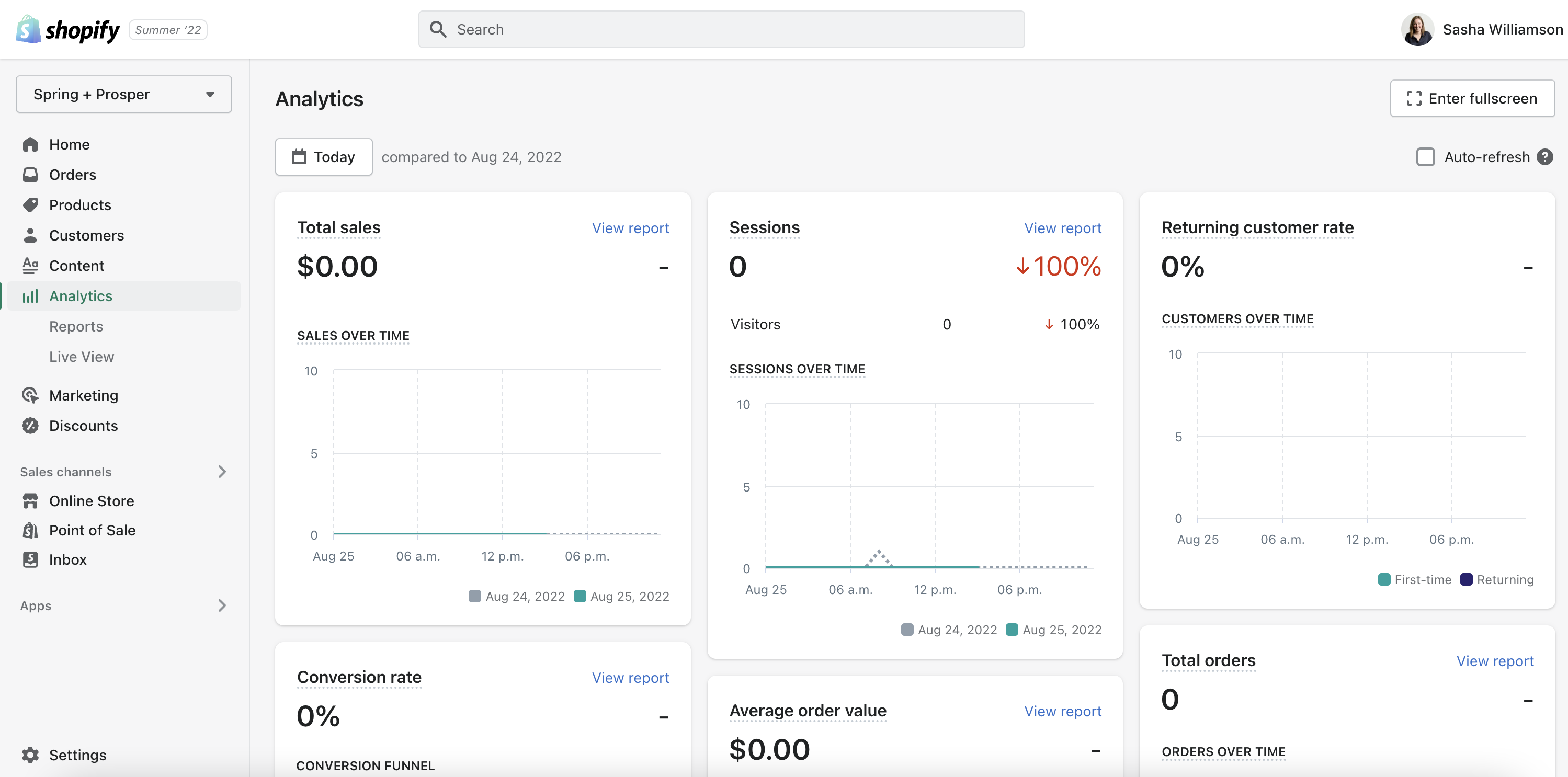
The overview dashboard is the landing page of Analytics. Over a million merchants access it every day. Despite its visibility and a changing user base, it hasn't had an update in 3 years. From June - August 2020 I led the research through the 'think' and 'explore' phases of this capstone project. Unfortunately, in mid-August, we got a new roadmap.
The overview dashboard doesn’t cater for different user roles or data literacy needs. There are usability issues and a limited number of metrics. As data literate merchants can’t extract and query the data they need, many download the reports and run their analysis outside of Shopify.
Our directive was to help merchants view relevant business analytics at the highest-level. This was a broad ask, so part of the project meant promoting and prioritizing user needs to create a vision. It also meant doing research which supported incremental changes as well as long term work to ensure the solution was scalable.
Led by design thinking activities, we aligned on a vision, prioritized work, and created two concepts for our first iteration of the overview dashboard. In parallel, we made progress on our thinking for the architecture of the overview dashboard and it’s surrounding pages.
Allow merchants to access and understand their most-used metrics by various dimensions to understand how their business is doing quickly.
Scoped for iteration 1: improve the organization of data on the overview dashboard to limit information overload, guide merchants on the analysis of key metrics, and make data easier to find.
When I joined the team, I ran a literature review. Its purpose was to help the team design for less data-literate users. We needed to help these merchants make good decisions with data.
An academic approach would prove the robustness of the UX team’s vision. I worried the report would fail to engage the team, so I included examples of how we could apply these ideas.
Decisions made: this was exploratory research but it gave product management an idea of what we would need to focus on to design for low data-literacy users.
One of the UX directives from our VP was to support tactical and strategic decision making. Merchants think of tactical and strategic decisions differently so we didn’t know how to build this concept into the product. We also questioned whether it was a good design direction.
I did a competitive review to see how other data platforms (outside e-commerce) were helping users make decisions with data.
Decisions made: I did see dashboards for both tactical and strategic decisions. They were often for one type of user (not organizations) and didn’t support hard decisions. It helped persuade our VP that Shopify is too complex to put all decisions and workflows into two groups.
To mix things up, I created a visual deliverable in Figma and questioned the hypotheses in a word doc.
Our VP announced a new set of projects in May; a refreshed overview dashboard and a new ‘analytics hub’. Product management had some assumptions about each page, but it felt rushed and we wanted some time to think through the problem.
Decisions made. After the workshop, leadership decided we should only focus on the overview dashboard. ‘Helping merchants get a long term view of the business’ and ‘customization to answer frequently asked questions’ were considered the most important needs.
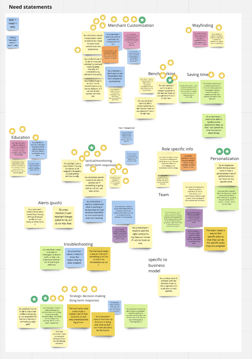
For the project kick-off, I ran an audit on the overview dashboard to show the gaps in our experience. I showed merchant questions in a decision tree and the limited data that we currently provide. This highlighted the need for new information architecture.

Decisions made: The audit helped product management understand the scale of the problem. It secured information architecture as an independent stream of work. I ran it concurrently with research for iteration 1.
The goal of the workshop was to collect the merchant questions to build out a decision tree. This would help us with the information architecture of the overview dashboard and it’s surrounding pages. It was important to do this to ensure our incremental builds were scalable.
Shenoah and I ran an asynchronous workshop with researchers across Shopify. Our goal was to capture:
Decisions made: we delivered 218 validated merchant questions to stakeholders. The metrics for iteration 1 were initially data-led, but Rebecca and I created a shortlist. The combined data & UXR approach meant our first iteration would have a scalable architecture.
My plan was to test the findability of data in three different hierarchies;
Unfortunately, the project was paused before this work could continue.
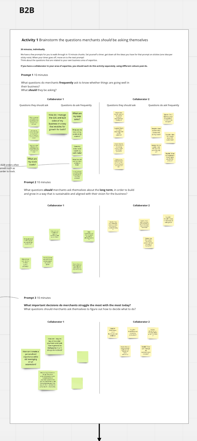
We knew everyone in the team would have ideas on how to redesign the overview dashboard. I ran a workshop with Miru to make sure we heard everyone’s thoughts and to get early feedback from engineering on the feasibility of ideas.
Decisions made: a number of the ideas from our co-creation workshop made it into later concept designs. The process also helped us align and reduce the appearance of silos.
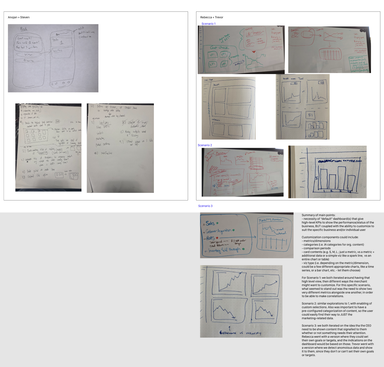
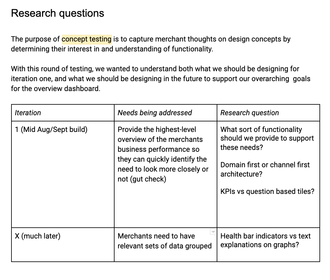
We had an aggressive deadline for iteration 1 and Anojan wanted us to focus on a very scoped goal (see objective 2). I persuaded him that the purpose concept testing to test a future vision that would prevent us from narrowing down on a solution too quickly. We’d still have learnings that would be applicable to iteration 1.
Because of our deadline I wanted to experiment with an unmoderated concept testing approach. Unfortunately, Validately was causing a bad participant experience so I switched to in-person sessions. I’d love to try it again in the future though.
Concept testing helped us understand how to design the architecture once the new data platform was up, and how to address our short term goals. Unfortunately, our VP cancelled the project before we released iteration 1.
Impact:
Results: